
The experience map helped me gain a holistic understanding of the user's journey, identify opportunities for intervention, and prioritize design efforts.
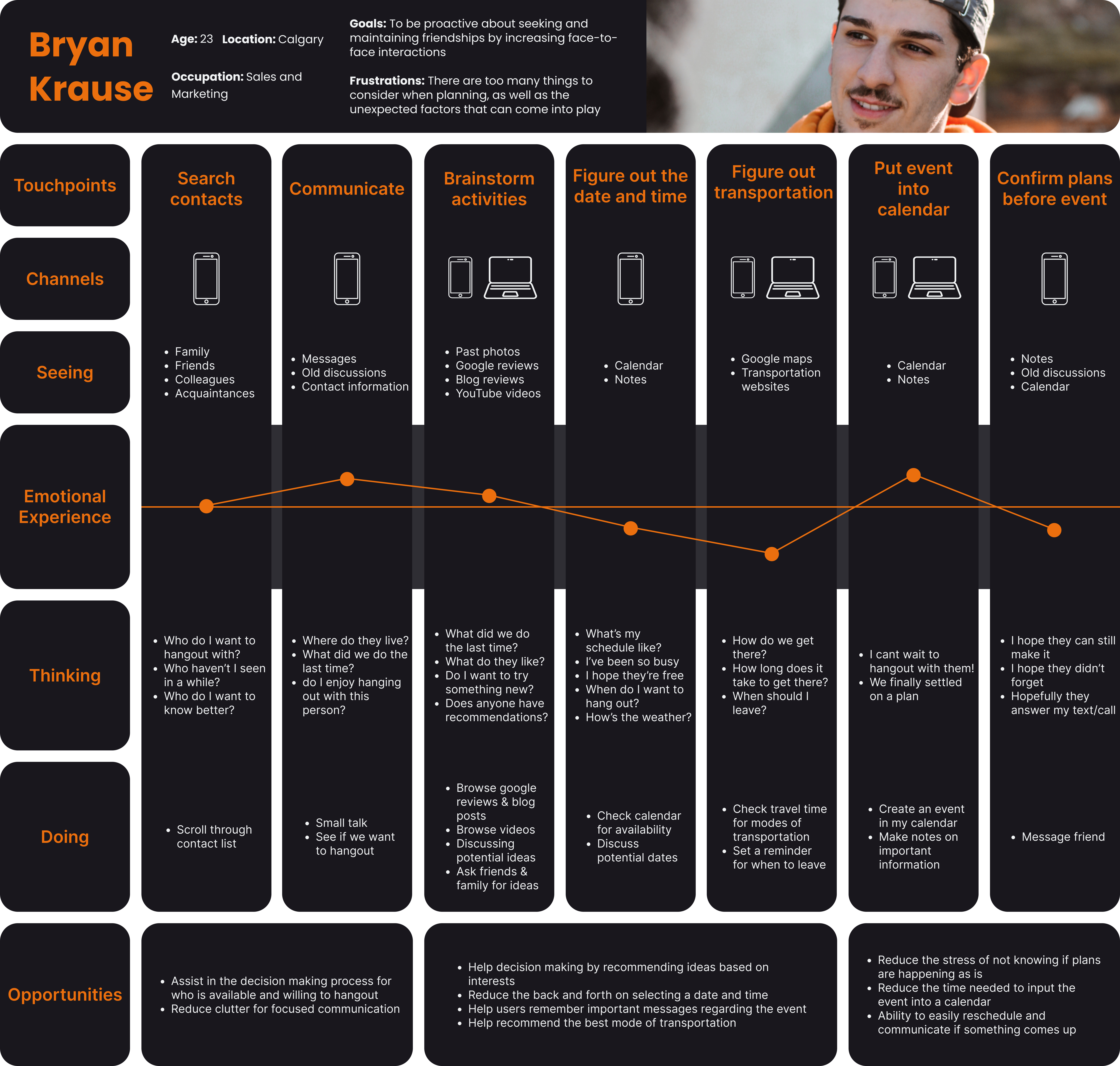
To provide the user with a strong foundation in which they can plan their social interactions. Important questions of who, what where and when must be answered and accounted for.
Opportunity for Intervention
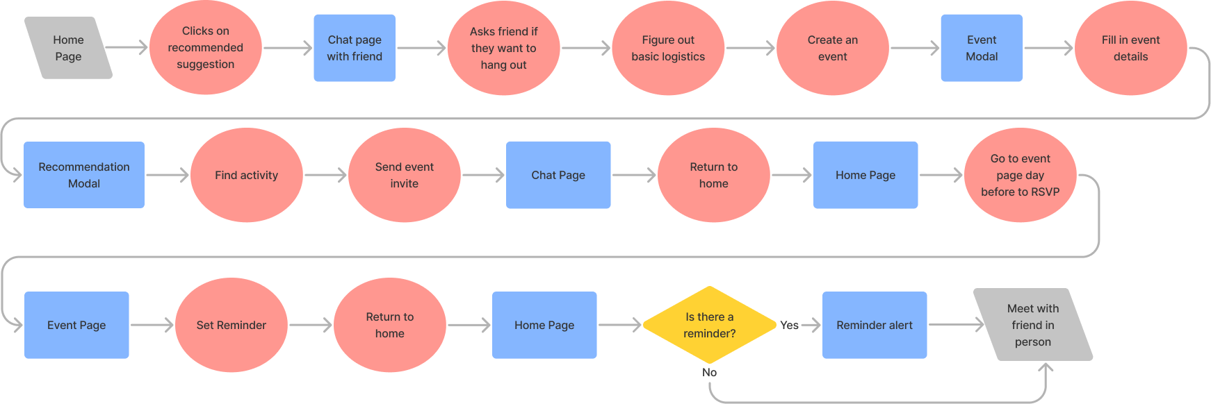
I created a task flow of the planning and communication process that precedes meeting up with a friend.
This gave me a first look at the potential structure of my solution, an opportunity to identify and define key interactions that take place between the user and the product. By thinking about how users may navigate through the flow, I was able to optimize the user's workflow and remove unnecessary interactions.

An opportunity to brainstorm and explore a wide range of ideas. I rapidly explored different design possibilities without investing time into producing detailed designs.
An opportunity to brainstorm and explore a wide range of ideas. I rapidly explored different design possibilities without investing time into producing detailed designs.
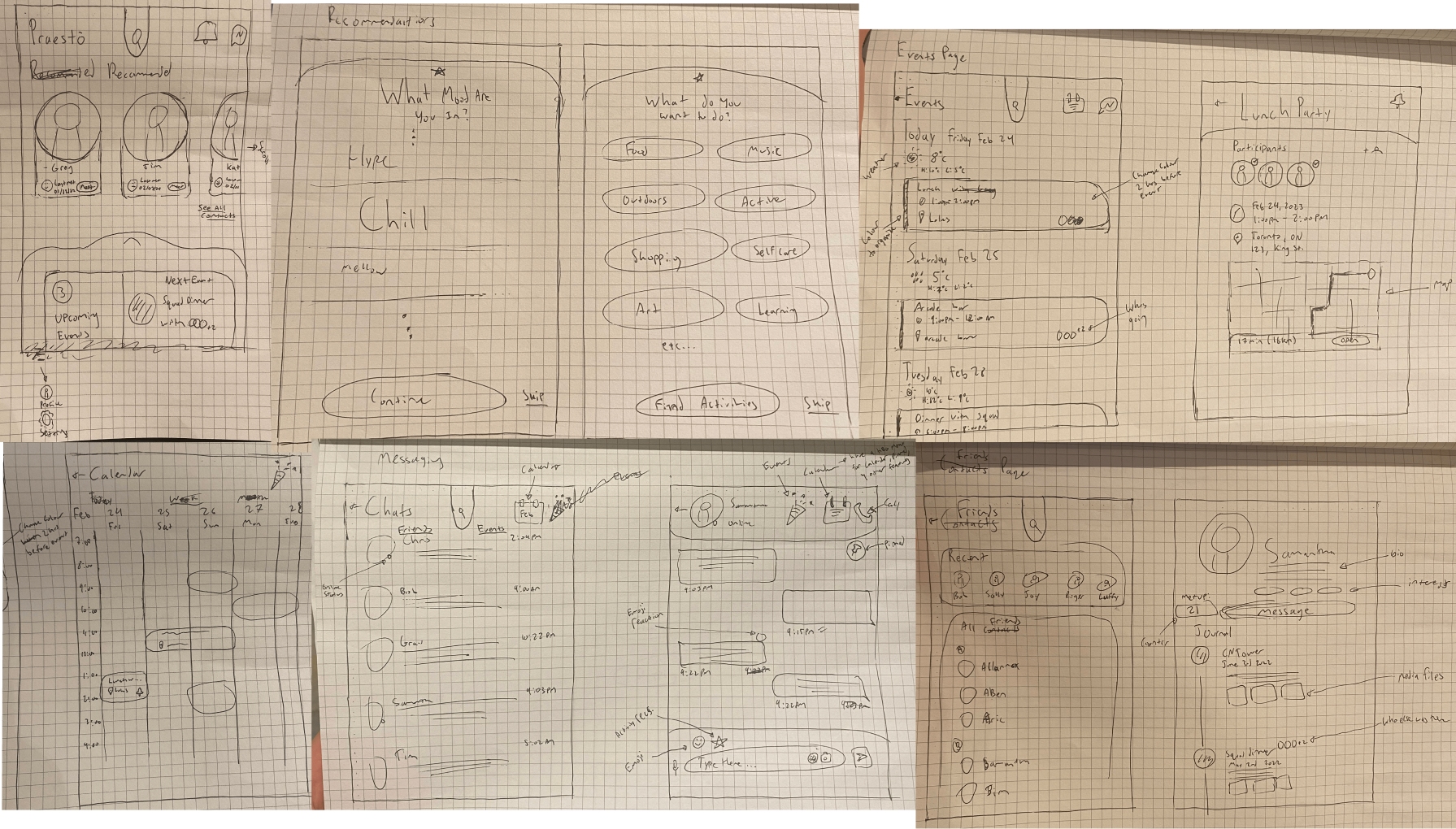
A tangible representation of my design concept with basic functionality. The goal is to create a usable prototype that can be easily modified for refinement.

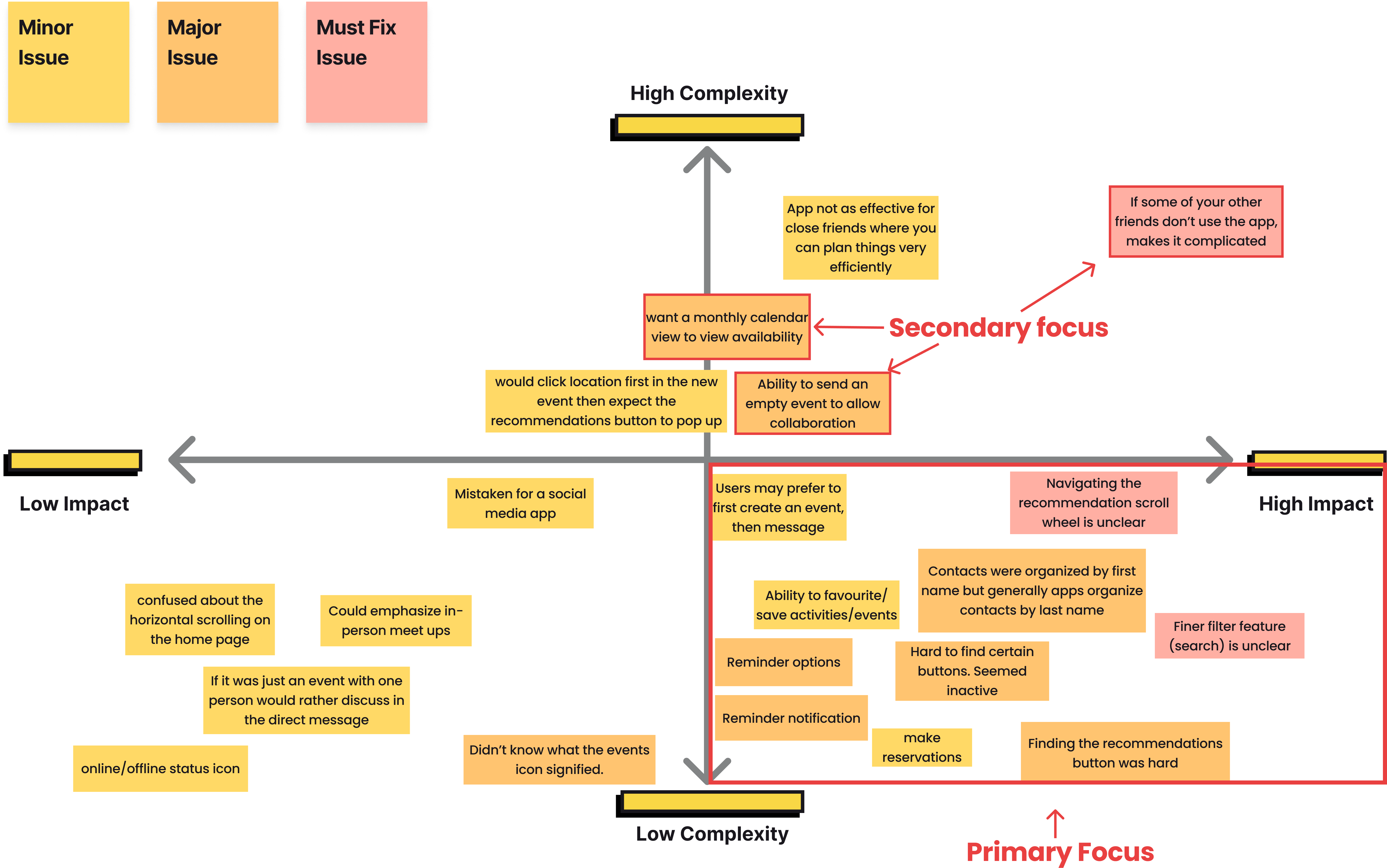
I conducted 2 rounds of usability testing with 5 different users per round. I kept a hands-off approach and allowed the users to organically experience the design concept.
Observed interactions with the prototype in real-time to identify: areas of confusion, difficulties, and frustrations that hinder UX.
Summarized the results in the Design Prioritization Matrix below and revised prototype based on the complexity and impact of the issue.
In a crowded marketplace, a strong brand identity helps a company or product stand out from competitors. It’s important to establish a unique and distinctive brand presence to create an emotional connection with my target audience.
Target demographic: young adults who find it increasingly difficult to maintain healthy relationships as they get busier.
Brand Adjectives:
- Reassuring
- Connected
- Supportive
- Friendly
- Committed
A collection of curated photos and tones as a visual guide to the overall experience and emotional connection I want to establish with my brand. I want to evoke a sense of reassurance, connection, support, friendliness, and commitment.

For effective brand recognition, I need a consistent and cohesive visual language that ensures the brand is represented uniformly across various channels (websites, advertisements, and social media).
To achieve this I developed a refined colour pallete for Praeto’s brand based on the colours extracted from my mood board to convey reassurance, connection, support, friendliness, and commitment:
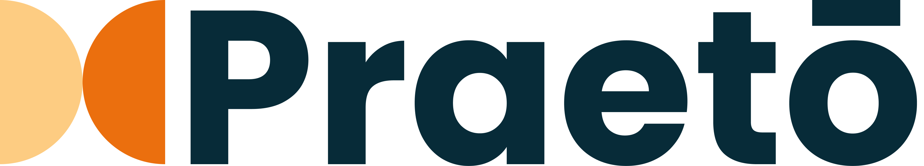
The name of my app “Praeto” is derived from the Latin word “Praesto” which means to be present.
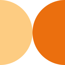
Logo: Two halves of a circle facing each other, needing to interact in order to become whole.
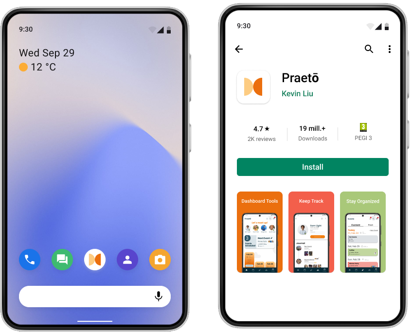
Application Icon: I decided to keep the application icon simple as my app’s goal is to help simplify my user’s planning process.
Wordmark: Simple, Inviting, Reliable, and Practical
I injected colours and made additional iterations on the UI/UX design based off of user feedback to create a hi-fi prototype that can simulate a realistic experience. Ready for additional testing for detailed feedback on a more accurate experience.
View Hi-Fi Prototype
A responsive product marketing website for desktop and mobile viewing to engage and educate my target market about Praeto’s value proposition
 View Desktop Site
The Why. The significance of constantly asking why myself why at each step of the design thinking process and being intentional my actions was a key lesson learned through the development of Praeto.
I realized that asking why is essential to establish a clear understanding of the problem I was aiming to solve. Through questioning the purpose and motivations behind Praeto, I ensured that I was addressing a genuine need for my user and that I wasn’t just designing for design's sake. By questioning the rationale behind my design choices, I was able to critically evaluate my decisions and justify them based on evidence and insights.
This approach helped me continuously learn and improve as I went along the design thinking process. Further, it prevented me from becoming complacent and pushed me to challenge my assumptions, iterate on my ideas, and ultimately deliver a refined and effective solution.
For the Future:
Although the capstone case study has wrapped up, there are still opportunities for continuous learning and improvement to enhance the user experience provided by Praeto:
- Improving interaction design for components
- Further user testing to iron out the wrinkles present in the current user experience
- Enhancing UI design - more cohesive & simpler
- Further develop edge features like the user’s profile, calendar, and reminder function.
- Review accessibility
- Business development plan and revenue model

